7 Aesthetics
7.1 Color

In looking at the graph created in the last section (shown above), it kind of seems like there may be different groups or clusters of penguins in this data. When you notice a pattern like this, it is worth looking into further and considering what variables you have in our data that could be related.
One way the penguins seem to be grouped is with a cluster at the top and another at the bottom:
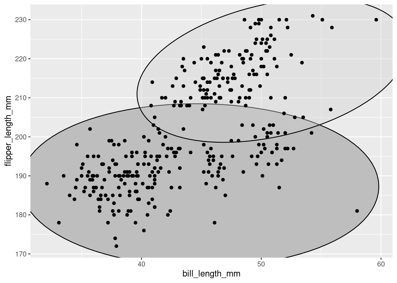
This might correspond to the sex variable in the dataset! Maybe it is the case that the bigger penguins were males, and the smaller ones were females?
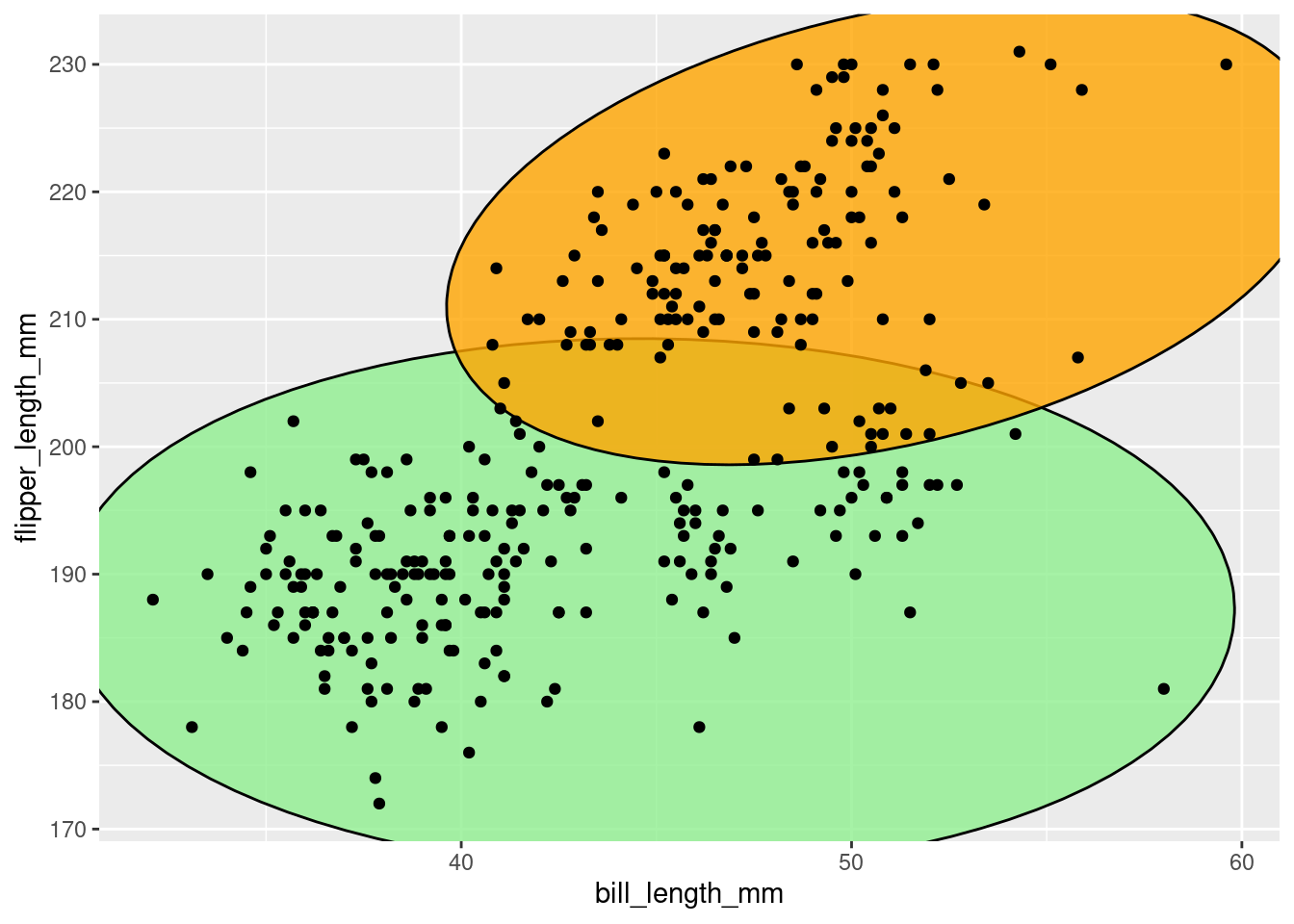
This idea could be explored if there was some way to visually indicate which of the observations on the graph were from male penguins and which were from female. Specifically, you want the color of the points to differ based on the value for that observation’s sex. In fact… you can do just that! One of the best parts about coding is you can always just try to run some code and see what happens!
It is often helpful to declare formal predictions. To do so, you specify two mutually exclusive alternatives that you could see when exploring some idea.
- “If it is the case that the differences in penguin size could be explained by what sex they are (e.g., bigger penguins were males and the smaller ones were females), then all the points in the cluster at the top would be one color and all the points in the cluster at the bottom would be a different color. If it is not the case that the differences in penguin size could be explained by what sex they are, the points in each of the two clusters would not have distinct colors.”
penguins %>%
  ggplot(mapping = aes(y = flipper_length_mm,
                       x = bill_length_mm),
         color = sex) +
  geom_point()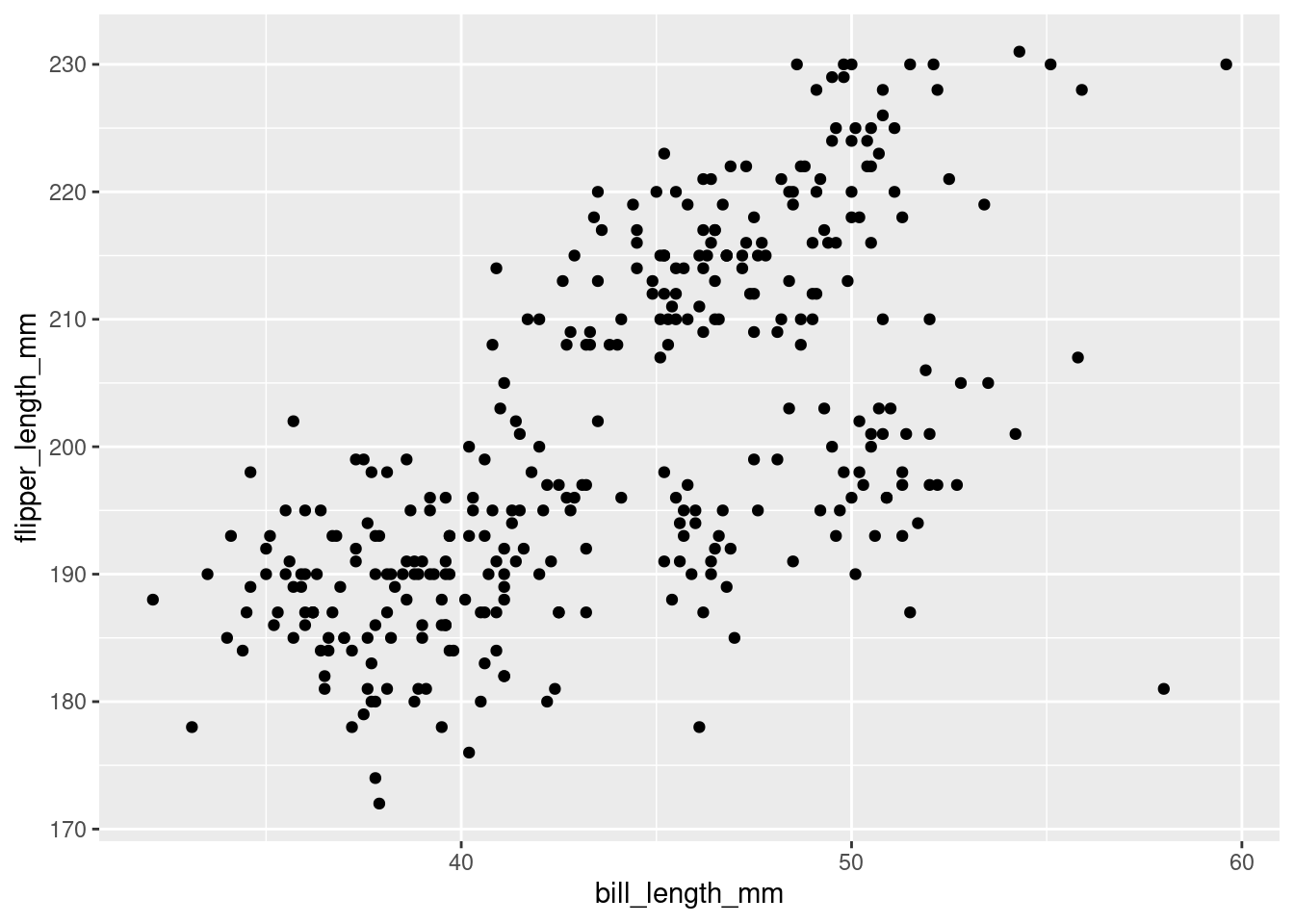
Uh… okay. So, that did not work. OH! Remember from above that aes() is used to tell ggplot what variables from the data should be mapped to the aesthetics you want to render on your graph? Color needs to be passed as another argument to the aesthetics of the plot via aes().
penguins %>%
  ggplot(mapping = aes(y = flipper_length_mm,
                       x = bill_length_mm,
                       color = sex)) +
  geom_point()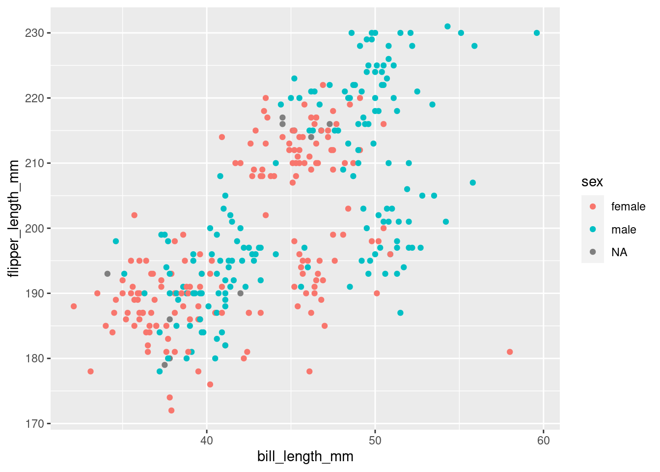
“Start by telling ggplot to use the
penguinsdataframe for the data, map flipper length to the y-axis and bill length to the x-axis. Represent each observation with a point, and map sex to the color of each point.”
That’s more like it! This does not really look like what you may have thought it would though. It is consistent with the other possible outcome, where sex does not explain the differences in penguin size. However, after looking at this more carefully, it actually kind of looks like there are 3 distinct clusters, not 2.
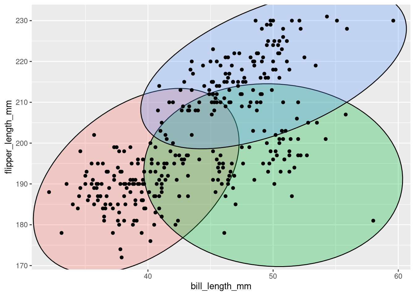
This might correspond to the species variable in the dataset! Maybe it is the case that different penguin species differ in size? That actually makes a lot more sense. This idea can be tested as well!
- “If it is the case that the differences in penguin size could be explained by what species they are, then all the points in each cluster would have distinct colors. If it is not the case that the differences in penguin size could be explained by what species they are, the points in each of the clusters would not have distinct colors.”
penguins %>%
  ggplot(mapping = aes(y = flipper_length_mm,
                       x = bill_length_mm,
                       color = species)) +
  geom_point()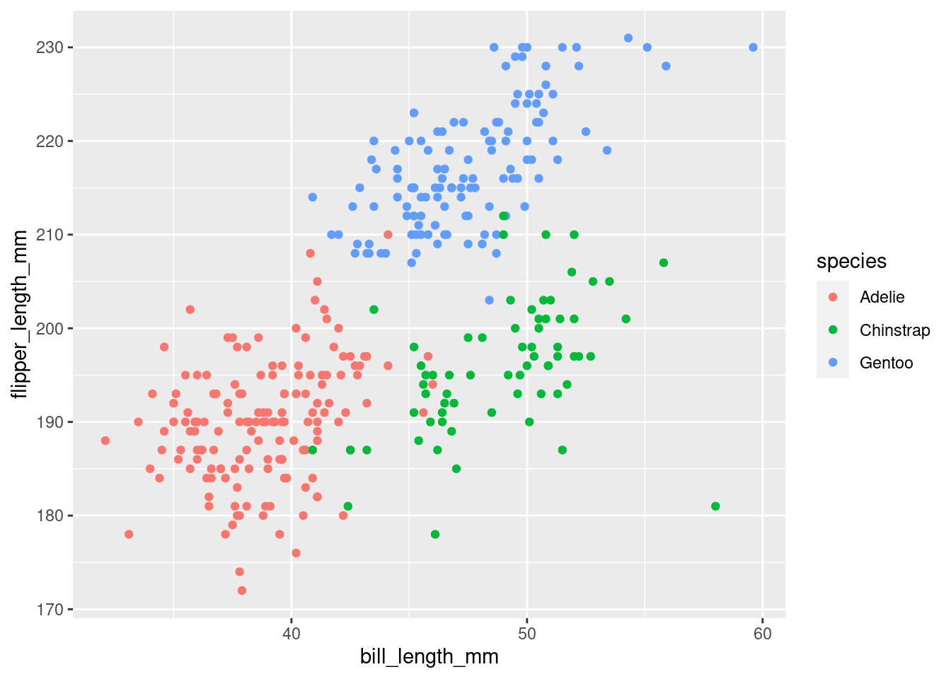
“Start by telling ggplot to use the
penguinsdataframe for the data, map flipper length to the y-axis and bill length to the x-axis. Represent each observation with a point, and map species to the color of each point.”
In the visualization it can be seen that, generally speaking, penguins with greater flipper length tend to have greater bill length as well. There seems to be a positive linear relationship between bill length and flipper length such that, as flipper length increases, bill length increases in turn. Additionally, penguins of the same species tend to have similar flipper and bill lengths, which are distinct from other species. Adelie penguins tend to have the shortest bill and flipper lengths, and Gentoo the longest. Chinstrap penguins seem to have shorter flippers but longer bills (which are similar to Gentoo).
Hot dang, looks like this could be a promising explanation for how penguins differ in size! There would obviously need to be some kind of formal statistical analysis to know for sure, but visualizing your raw data in ways like this allow you to quickly get insights into different questions you may want to use your data to answer.
7.1.1 Global vs Local Aesthetics
When first describing this visualization, one of the things noted was that, “There seems to be a positive linear relationship between bill length and flipper length such that, as flipper length increases, bill length increases in turn.” It can be helpful to add the line of best fit to actually see this linear relationship. You can do this by using geom_smooth(). A few arguments need to be set within geom_smooth(), but you do not have to worry much about those for our purposes here.
The code from above will be copy/pasted and the new geom_smooth() call can be added directly to it. By doing so the best fitting line for all of the data will be displayed.
penguins %>%
  ggplot(mapping = aes(y = flipper_length_mm,
                       x = bill_length_mm,
                       color = species)) +
  geom_point() +
  geom_smooth(method = "lm", se = FALSE)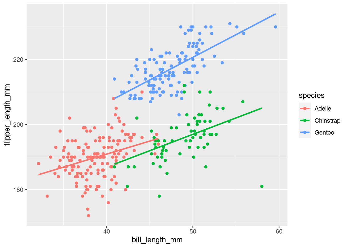
“Start by telling ggplot to use the
penguinsdataframe for the data, map flipper length to the y-axis and bill length to the x-axis. Represent each observation with a point, and map species to the color of each point. Add a line of best fit for the data.”
Hey, wait, that is not quite what was expected… Instead of there being one line for all of the data, it looks like there is a line for each species. What is happening here is highlighting the difference between a global aesthetic (those put in the ggplot() call and applied to ALL added parts of your graph) and a local aesthetic (those put in individual geoms and apply only to those individual ones).
Color should be moved into the geom_point() call, because that is the only thing that should be mapped to the values of species in the data.
penguins %>%
  ggplot(aes(y = flipper_length_mm,
             x = bill_length_mm)) +
  geom_point(aes(color = species)) +
  geom_smooth(method = "lm", se = FALSE)
Alright! The points are still colored by species, but there is just the one line for all the data, as was originally intended. You will also notice that a mapping= was not specified in geom_point(), and it was removed from the ggplot() as well! It actually is not necessary to specify that. Once you have the hang of things, you can leave that part out.
7.1.2 Setting vs Mapping Aesthetics
Above, to change the color of your points (and inadvertently our line of best fit), the color argument was specified in the aes() call to map the values to the species variable in the data. What if you did not want to map something to a variable in your data? What if you just want to set the value of something yourself? You might think, “maybe I just take it out of the mapping = aes() part?” And you would be right, because you are smart! Look at the example below that does just that to try and change all the points to orange (so they have a good contrast with the line).
penguins %>%
  ggplot(aes(y = flipper_length_mm,
             x = bill_length_mm)) +
  geom_point(color = orange) +
  geom_smooth(method = "lm", se = FALSE)
#> Error in eval(expr, envir, enclos): object 'orange' not found
Well, okay, this obviously is not right because it results in an error:
Error in layer(data = data, mapping = mapping, stat = stat, geom = GeomPoint, : object ‘orange’ not found
By writing orange like this, R thinks it is a variable in the penguins dataset that was piped in to ggplot! To tell R that this is NOT a variable/object that is defined, and instead just the color orange, you use quotes.
penguins %>%
  ggplot(aes(y = flipper_length_mm,
             x = bill_length_mm)) +
  geom_point(color = "orange") +
  geom_smooth(method = "lm", se = FALSE)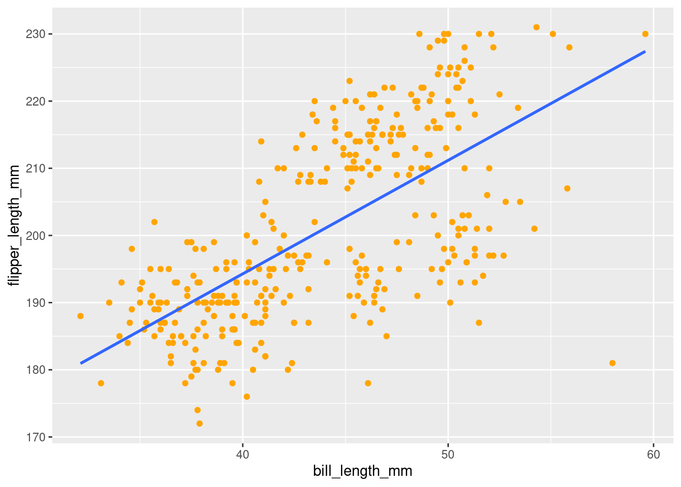
Much better! You can do this for any geom:
penguins %>%
  ggplot(aes(y = flipper_length_mm,
             x = bill_length_mm)) +
  geom_point(color = "orange") +
  geom_smooth(method = "lm", se = FALSE, color = "purple")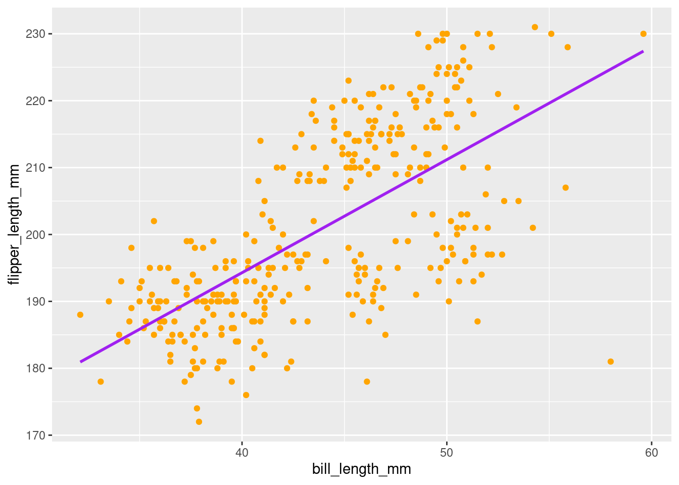
Note: Aesthetic settings can only be set locally, not globally. Aesthetic mappings can be local OR global. See the example below that tries to use an aesthetic setting globally:
penguins %>%
  ggplot(aes(y = flipper_length_mm,
             x = bill_length_mm),
         color = "orange") +
  geom_point() +
  geom_smooth(method = "lm", se = FALSE)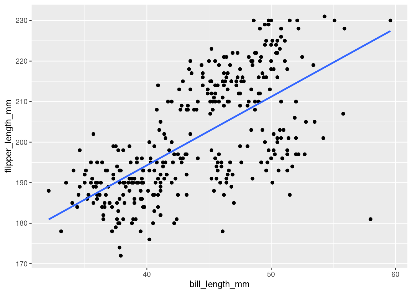
7.1.3 Setting Colors
When setting a color, this can be done by name, as was done above, or by hexcode:
penguins %>%
  ggplot(aes(y = flipper_length_mm,
             x = bill_length_mm)) +
  geom_point(color = "#9FE2BF") +
  geom_smooth(method = "lm", se = FALSE, color = "#FFBF00")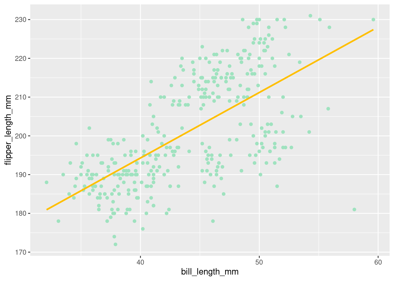
A neat thing you can do is to set your colors based on some logical operation! For example, if you wanted to color penguins with flipper lengths greater than 200 as one color, and those with flipper lengths not greater than 200 another color, you could do the following:
penguins %>%
  ggplot(aes(y = flipper_length_mm,
             x = bill_length_mm)) +
  geom_point(aes(color = flipper_length_mm > 200)) +
  geom_smooth(method = "lm", se = FALSE, color = "#FFBF00")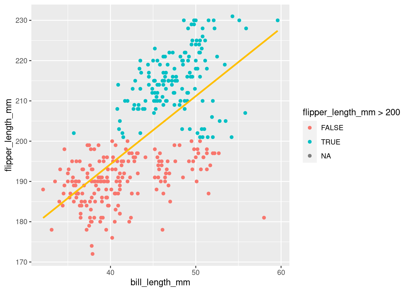
Notice that the color was just set to be equal to a simple logical test! This is still a mapped aesthetic, because it will be based on values of a variable in your data.
There are tons of good color guides you can find on google. Here are couple:
More on colors will be covered in a later chapter
7.2 Shape
7.2.1 Mapping
Color is one of the aesthetics you can change, but there are many others too! Another one is shape. Like color, shape can be mapped to a variable in your data. In addition to changing the color of the points by species, the code below will change their shape too!
penguins %>%
  ggplot(aes(y = flipper_length_mm,
             x = bill_length_mm)) +
  geom_point(aes(color = species,
                 shape = species)) +
  geom_smooth(method = "lm", se = FALSE)
“Start by telling ggplot to use the
penguinsdataframe for the data, map flipper length to the y-axis and bill length to the x-axis. Represent each observation with a point, and map species to the color of each point. Add a line of best fit for the data and change the shape of each point to be mapped to species.”
However, you do not have to map the same aesthetic. The shape could be mapped to a different aesthetic too! Consider what happens when mapping it to island instead.
penguins %>%
  ggplot(aes(y = flipper_length_mm,
             x = bill_length_mm)) +
  geom_point(aes(color = species,
                 shape = island)) +
  geom_smooth(method = "lm", se = FALSE)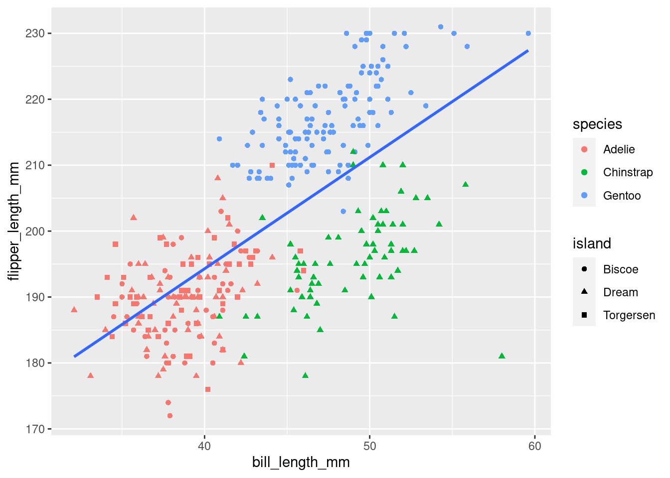
You will now notice that instead of each coloring having one shape, as when you mapped them to the same variable, the colors now have multiple shapes! Mapping another variable to a different aesthetic visualizes even more data and patterns in your dataset! It can quickly become overwhelming and difficult to interpret though, so it is often best to try to just communicate one main relationship or pattern in your visualizations. For practice though, you can go nuts!
7.2.2 Setting
There are a number of different shapes you can choose from when setting yourself. These can be selected by number:
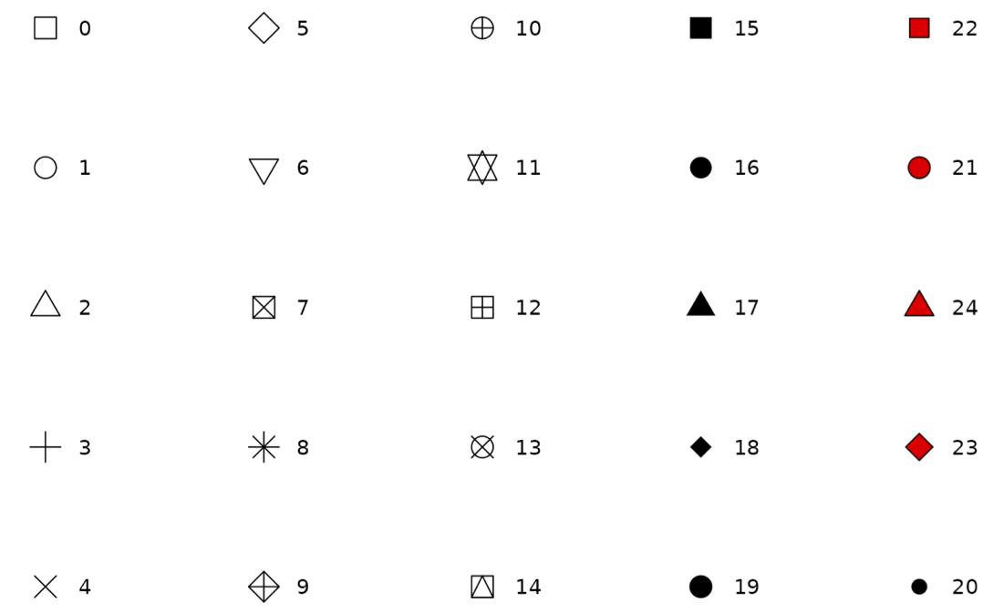
or by name:
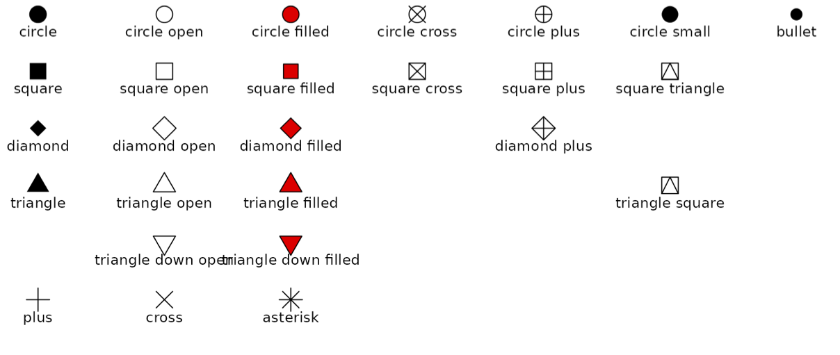
Source: ggplot documentation
You will notice that there appear to be different versions for several shapes. For example, there appears to be 3 different kinds of triangles. Their differences are compared below:
- 17 or ‘triangle’
- Solid color shape
penguins %>%
  ggplot(aes(y = flipper_length_mm,
             x = bill_length_mm)) +
  geom_point(aes(color = species),
             shape = 17) +
  geom_smooth(method = "lm", se = FALSE)
- 2 or ‘triangle open’
- Colored shape outline with hollow center
penguins %>%
  ggplot(aes(y = flipper_length_mm,
             x = bill_length_mm)) +
  geom_point(aes(color = species),
             shape = 2) +
  geom_smooth(method = "lm", se = FALSE)
- 24 or ‘triangle filled’
- Colored shape outline with center that can be filled with another color
penguins %>%
  ggplot(aes(y = flipper_length_mm,
             x = bill_length_mm)) +
  geom_point(aes(color = species),
             shape = 24,
             fill = 'darkgrey') +
  geom_smooth(method = "lm", se = FALSE)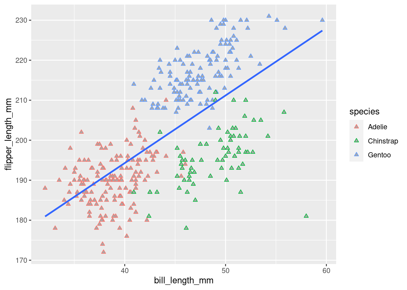
This introduces another way to change colors in ggplot! When changing the color of something, some geoms have a ‘color’ argument, some have a ‘fill’ argument, and some, like here, have both! ‘color’ often refers to the outline/outside, while ‘fill’ often refers to… well, the fill!
7.3 Size
7.3.1 Mapping
So, it was actually kind of hard to see some of those shape differences, wasn’t it? The points on the graph were just too small. It would be helpful if the size could be changed. Wouldn’t you know it, size happens to be another aesthetic! Below is an example of mapping size:
penguins %>%
  ggplot(aes(y = flipper_length_mm,
             x = bill_length_mm)) +
  geom_point(aes(color = species,
                 shape = species,
                 size = species)) +
  geom_smooth(method = "lm", se = FALSE)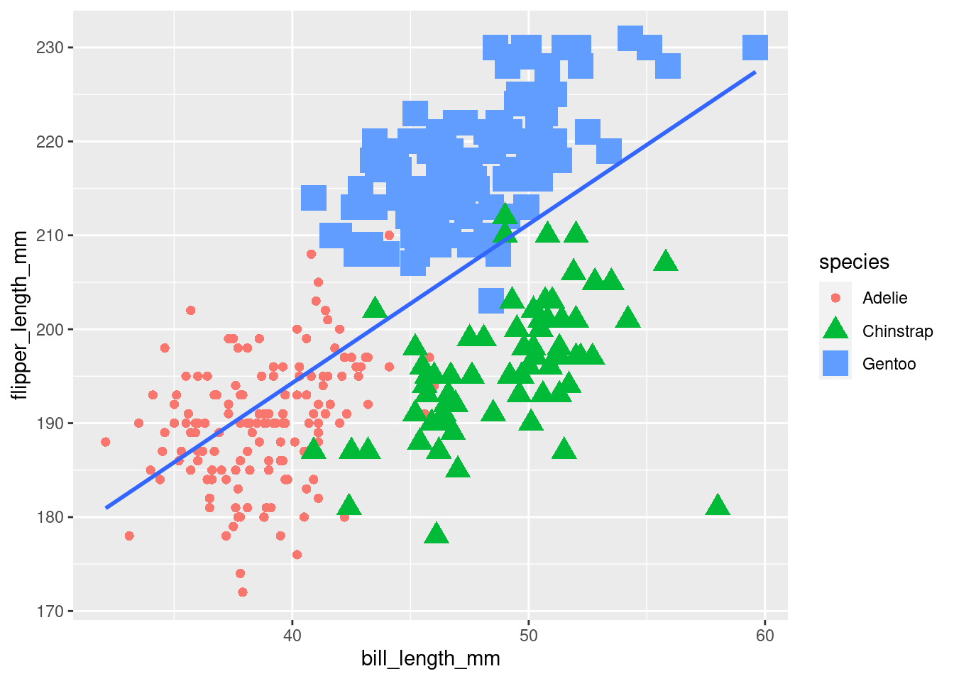
“Start by telling ggplot to use the
penguinsdataframe for the data, map flipper length to the y-axis and bill length to the x-axis. Represent each observation with a point, and map species to the color of each point. Add a line of best fit for the data, change the shape of each point to be mapped to species and do the same with corresponding size changes.”
Well, this looks pretty terrible, but it gets the point across! One other thing this does is demonstrate what is meant by saying, “ggplot is additive/layered”.geom_smooth() was the last geom added here. That means, quite literally, it is added on top of the graph rendered by the previous code. It gets put on top, which is why it runs over and covers up some of the observations.
Think about what the graph would look like if you were to have added the geom_smooth() first and geom_point() second, then click the button below to find out:

This concept is very important to keep in mind when creating your visualizations. Order matters!
7.3.2 Setting
Maybe instead of mapping this… you should just change the size yourself. For example, you could take one of the graphs from above and make the shapes a little bit larger.
penguins %>%
  ggplot(aes(y = flipper_length_mm,
             x = bill_length_mm)) +
  geom_point(aes(color = species),
             shape = 24,
             fill = 'darkgrey',
             size = 4) +
  geom_smooth(method = "lm", se = FALSE)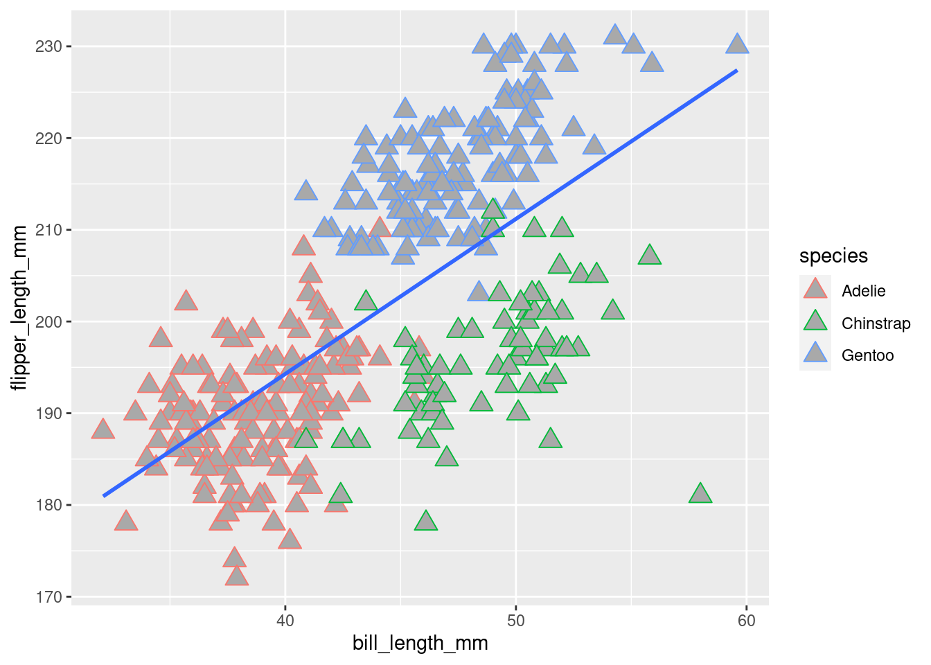
Wow, okay, this shows the fill a lot better than before! You can actually do some pretty neat things by playing around with different size values. For example:
penguins %>%
  ggplot(aes(y = flipper_length_mm,
             x = bill_length_mm)) +
  geom_point(aes(color = species)) +
  geom_point(aes(color = species),
             size = 4,
             shape = 6) +
  geom_smooth(method = "lm", se = FALSE)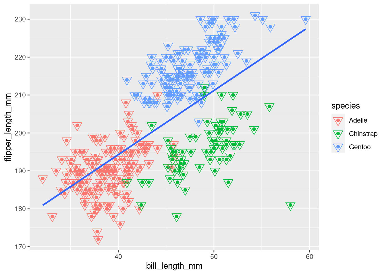
7.4 Alpha
7.4.1 Mapping
The alpha aesthetic changes how translucent vs opaque something is.
penguins %>%
  ggplot(aes(y = flipper_length_mm,
             x = bill_length_mm)) +
  geom_point(aes(color = species,
                 shape = species,
                 size = species,
                 alpha = species)) +
  geom_smooth(method = "lm", se = FALSE)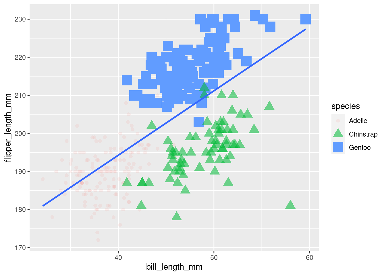
“Start by telling ggplot to use the
penguinsdataframe for the data, map flipper length to the y-axis and bill length to the x-axis. Represent each observation with a point, and map species to the color of each point. Add a line of best fit for the data, change the shape of each point to be mapped to species, and do the same with corresponding size changes and alpha changes.”
As you can see, using alpha as a mapped aesthetic is not particularly useful. There are few, if any, instances where you would want to do this.
7.4.2 Setting
More often, you will want to set the alpha levels of different elements of your graphs yourself. Alpha values range from 0-1, with 0 being completely transparent and 1 being completely opaque.
Compare the two graphs below and note their alpha levels:
penguins %>%
  ggplot(aes(y = flipper_length_mm,
             x = bill_length_mm)) +
  geom_point(aes(color = species,
                 shape = species),
             size = 3,
             alpha = 0.8) +
  geom_smooth(method = "lm", se = FALSE)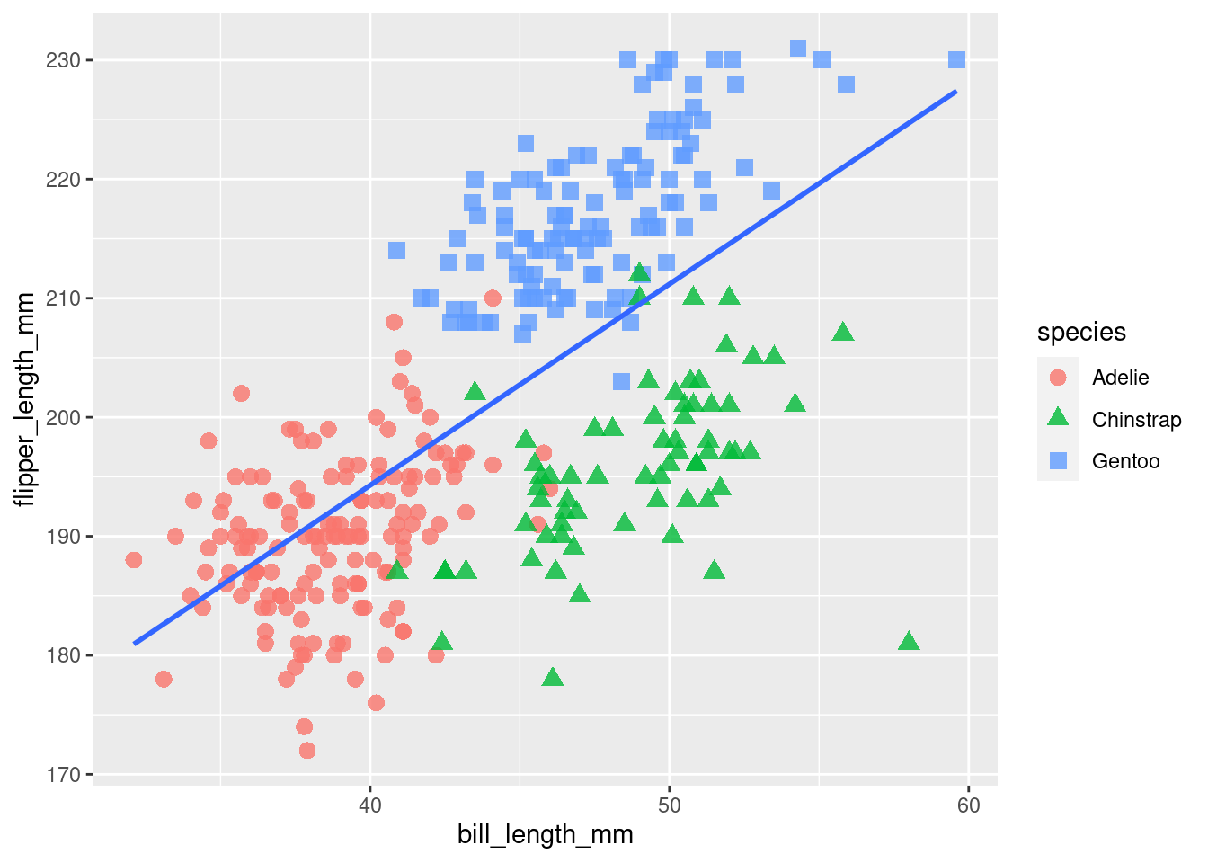
penguins %>%
  ggplot(aes(y = flipper_length_mm,
             x = bill_length_mm)) +
  geom_point(aes(color = species,
                 shape = species),
             size = 3,
             alpha = 0.3) +
  geom_smooth(method = "lm", se = FALSE)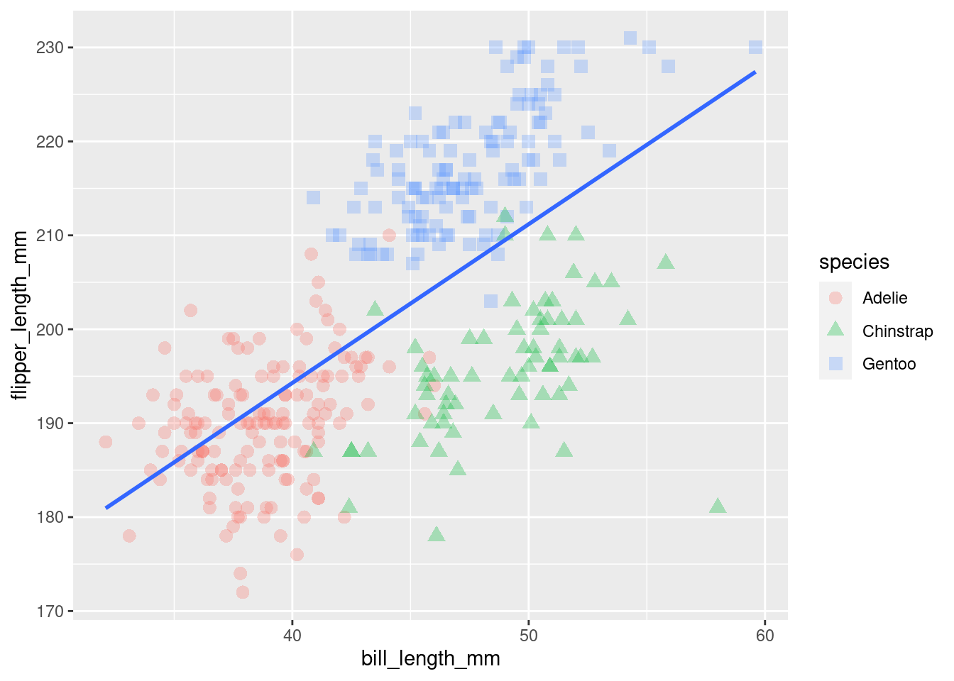
While you are working with a (relatively) small dataset here, you may already see how alpha changes could be extremely useful when working with larger datasets:
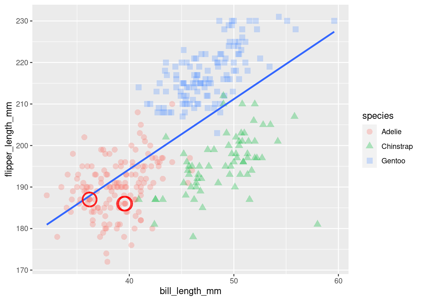
Looking at the observations highlighted with red circles, you can notice that they are darker in color than other observations from the same species. This means there are multiple observations with the same values being rendered in the same spot on your graph. When the observations are completely opaque (no alpha), some may be obscured by others occupying the same space!
This is even more clear when looking at an example from the built in diamonds dataset:
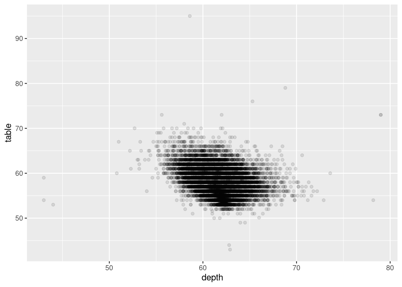
Even with a very low alpha (look how faint the points outside the center cluster are), you can see just how many observations are overlapping! You will see better ways to visualize data like this later.
7.5 References:
Horst AM, Hill AP, Gorman KB (2020). palmerpenguins: Palmer Archipelago (Antarctica) penguin data. R package version 0.1.0. https://allisonhorst.github.io/palmerpenguins/