9 Customization
You now have a number of different graphs in your toolkit to use when visualizing different types of relationships or comparisons in your data. You also learned a lot of ways to tinker with the geoms and their aesthetics. Now it is time to add some techniques and skills to customize the other elements of the graphs.
This will serve as a base plot to customize:
base_plot = penguins %>%
  ggplot(aes(y = body_mass_g, x = island)) +
  geom_jitter(height = 0, width = 0.1,
              size = 2, alpha = 0.3,
              aes(color=island)) +
    stat_summary(fun.data = "mean_se",
               geom = "pointrange",
               color = "black",
               aes(fill = island),
               shape = 21,
               size = 0.5)

base_plot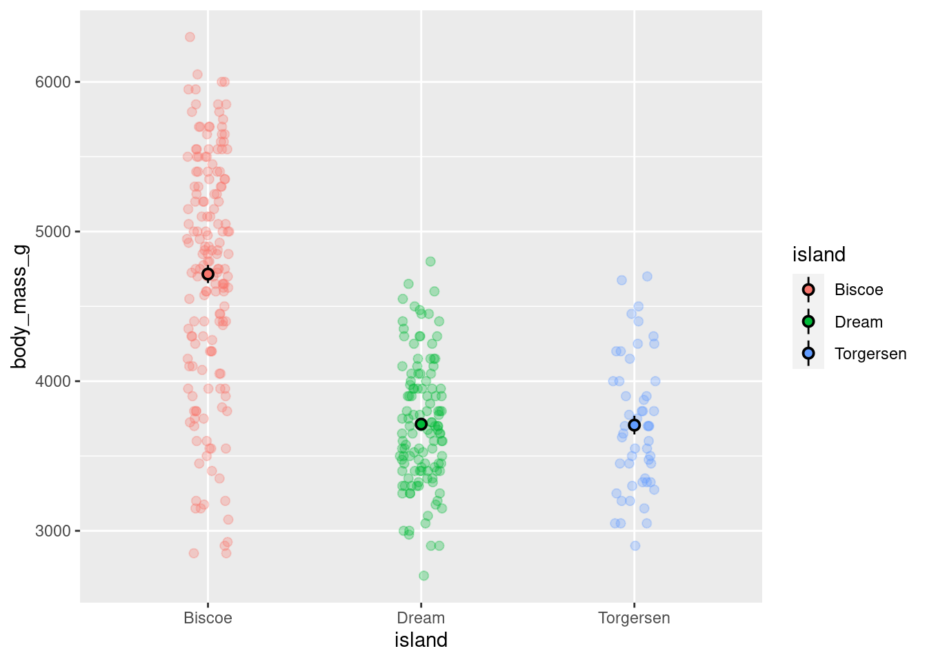
Saving the visualization to a variable prevents the need to copy/paste the entire code each time.
9.1 Scaling The Axes
By default, ggplot will use axes settings that it thinks best highlight the data being visualized. Here, the y-axis runs from ~2000 - 7000 and has intervals of 1000 starting at 3000.
This can be changed using a scale_*_* function. The first * is replaced by which axis you want to modify, and the second with what type of data or scale you want it to have. Here, the y-axis is continuous, so scale_y_continuous() would be used. Its arguments can be used to modify what is shown on the axis. There are two reasons why you might want to change this.
Generally speaking, it is good practice to have your axes start at 0 and show the full scale. It can be misleading when parts of a scale are obscured and removed.
You might have an issue with points being jittered past the scale and result in the Warning message covered in previous lessons.
base_plot +
  scale_y_continuous(breaks = seq(from = 0, to = 7000, by = 500),
                     labels = seq(from = 0, to = 7000, by = 500))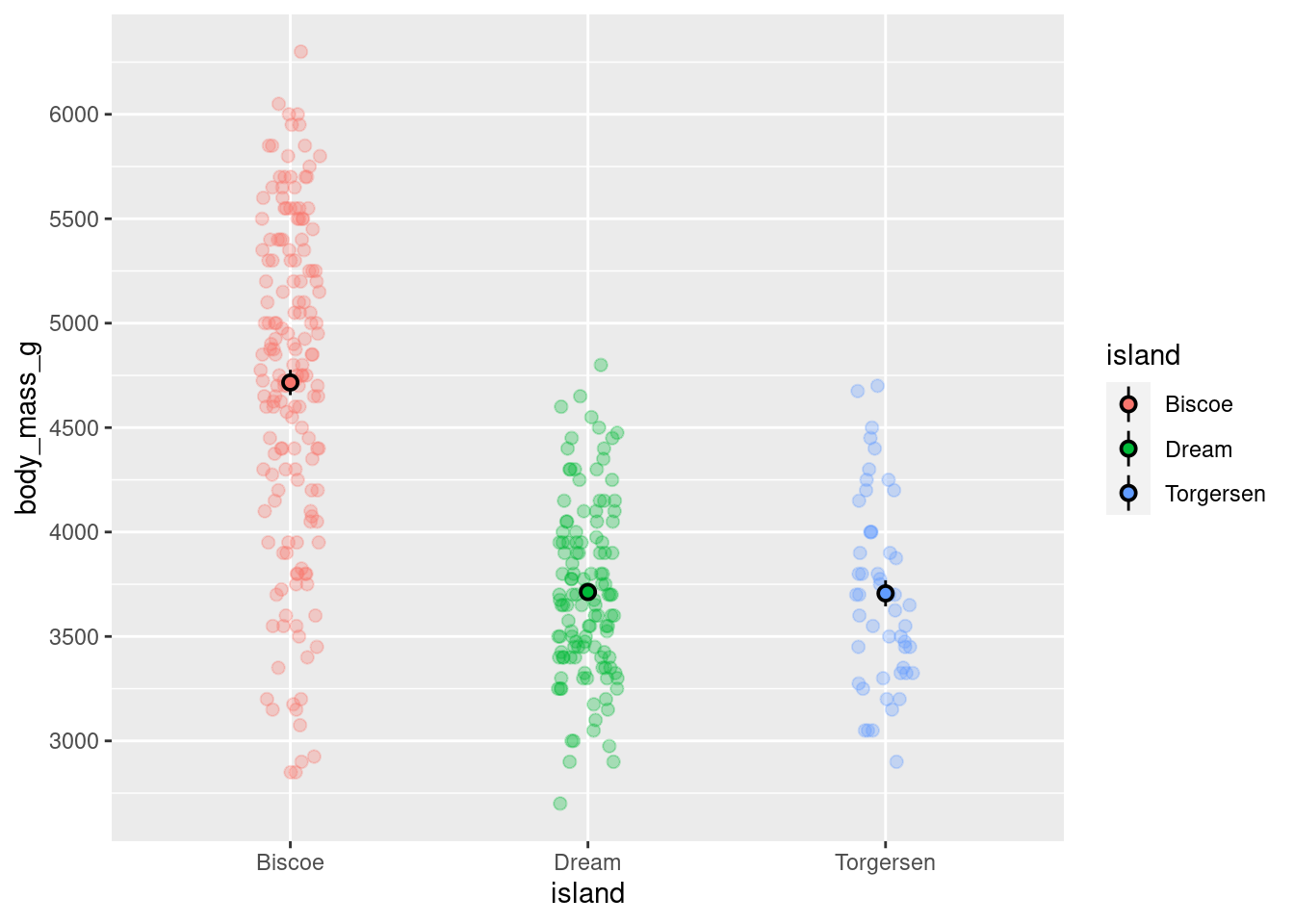
Hm. So it DID change the intervals from 1000 to 500, but it still only shows values from 3000 to 6000. This is because the actual range of the axis was not changed. Remember that all graphs are plotted with (x,y) cartesian coordinates. With this in mind, what needs to be modified are the limits of that coordinate system. This can be done with coord_cartesian().
base_plot +
  coord_cartesian(ylim = c(0,7000)) +
  scale_y_continuous(breaks = seq(from = 0, to = 7000, by = 500),
                     labels = seq(from = 0, to = 7000, by = 500))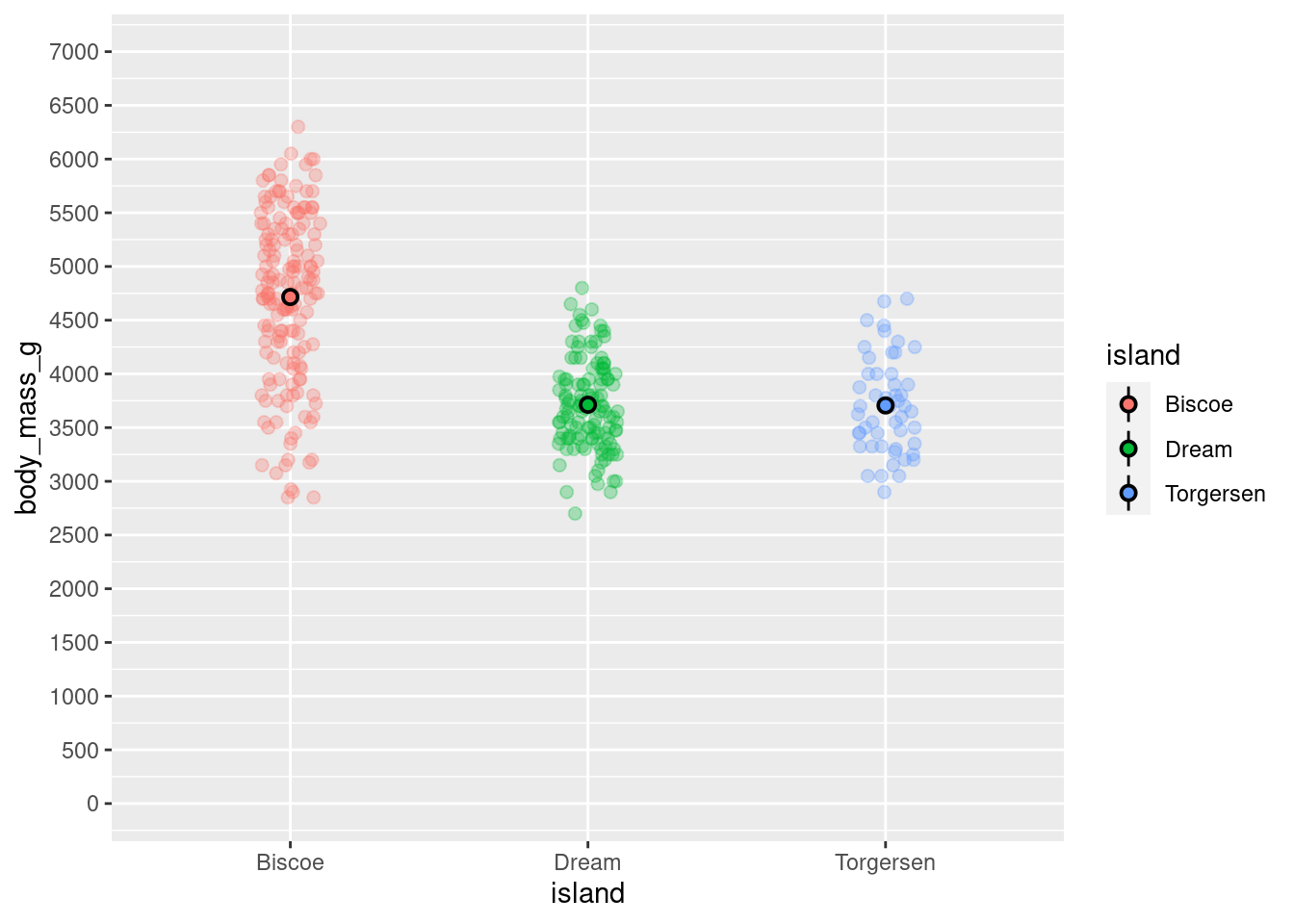
Changing the limits of the coordinate system changes the zoom of your visualization and not the underlying data.
There are a number of other scale commands that override the default, such as scale_y_log10(), scale_y_sqrt(), and scale_y_reverse(), to quickly and easily change the scale. Instead of having to completely transform all your data, just adding a transform to the axis in your plot can be a big time saver and much safer!
9.1.1 Get Rid Of Padding
Even though the y-axis starts at 0 now, there is a bit of space between the actual start of the graph and the 0. By default there will be a bit of padding. This can be particularly egregious when you have bars:
penguins %>%
  ggplot(aes(y = body_mass_g, x = island)) +
  stat_summary(fun = "mean", geom = "bar")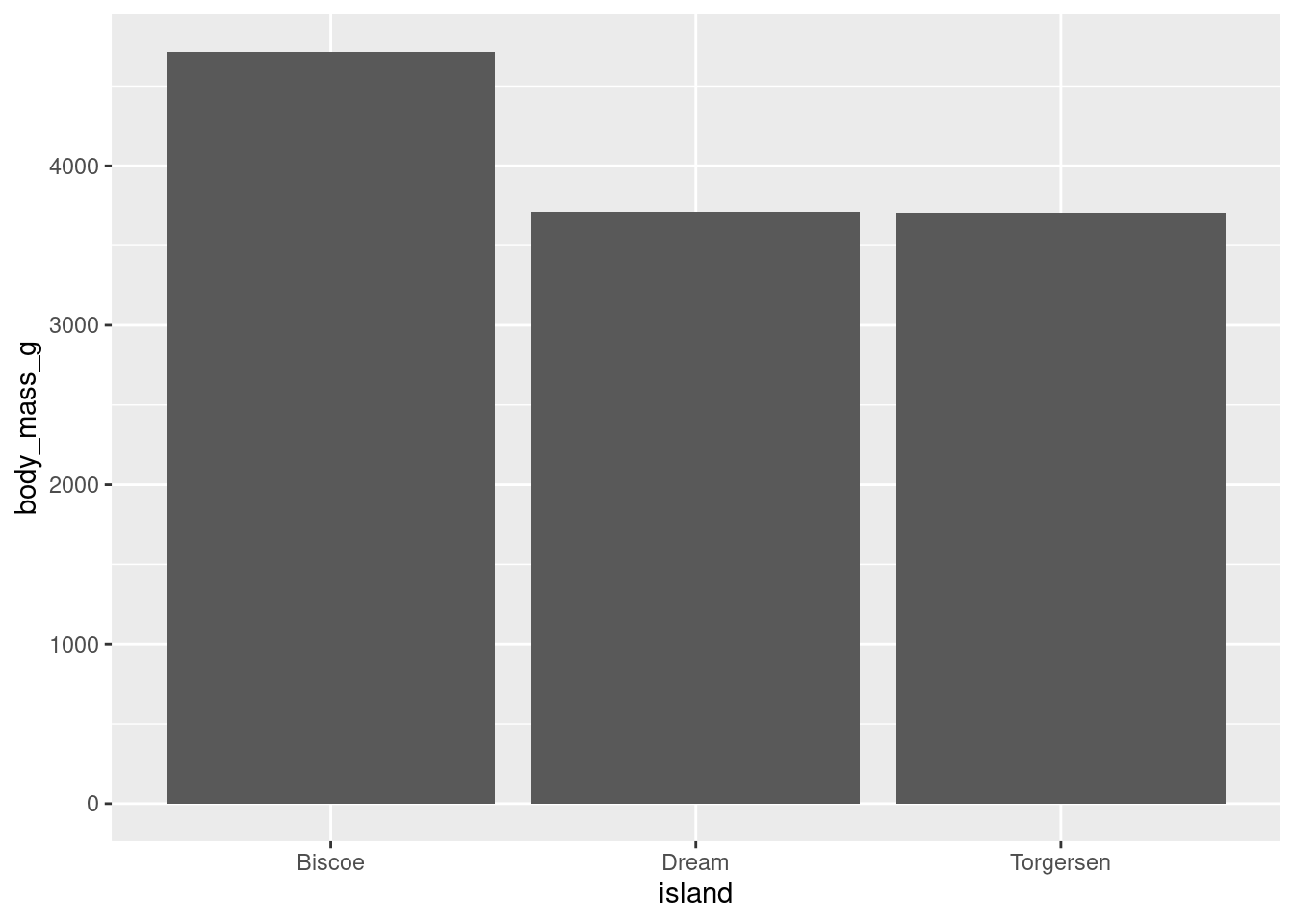
This can be eliminated with the expand argument.
base_plot +
  coord_cartesian(ylim = c(0,7000)) +
  scale_y_continuous(breaks = seq(from = 0, to = 7000, by = 500),
                     labels = seq(from = 0, to = 7000, by = 500),
                     expand = c(0,0))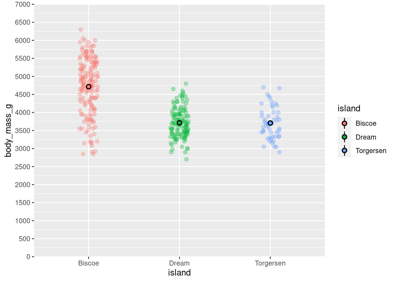
9.2 Titles, Captions, and Labels, Oh My!
While it is the case that your visualization should be interpretable without reference to a title or caption, a good visualization should have a clear and informative title. Additionally, you may have noticed that ggplot uses the variable names and values as the x- and y-axis labels and values, respectively. It is often the case that the names that are easiest to work with for data manipulation/cleaning are not what you want displayed on your visualizations.
Fortunately, it is extremely easy to change all of these things! They are all different arguments that can be passed to the labs() function:
base_plot +
  coord_cartesian(ylim = c(0,7000)) +
  scale_y_continuous(breaks = seq(from = 0, to = 7000, by = 500),
                     labels = seq(from = 0, to = 7000, by = 500),
                     expand = c(0,0)) +
  labs(title = "How Does Penguin Weight Vary Across Islands?",
       subtitle = "Islands Contain Different Penguin Species",
       y = "Body Mass (grams)",
       x = "Island",
       tag = "Figure 1",
       caption = "Note: Error bars represent +/- 1 SEM")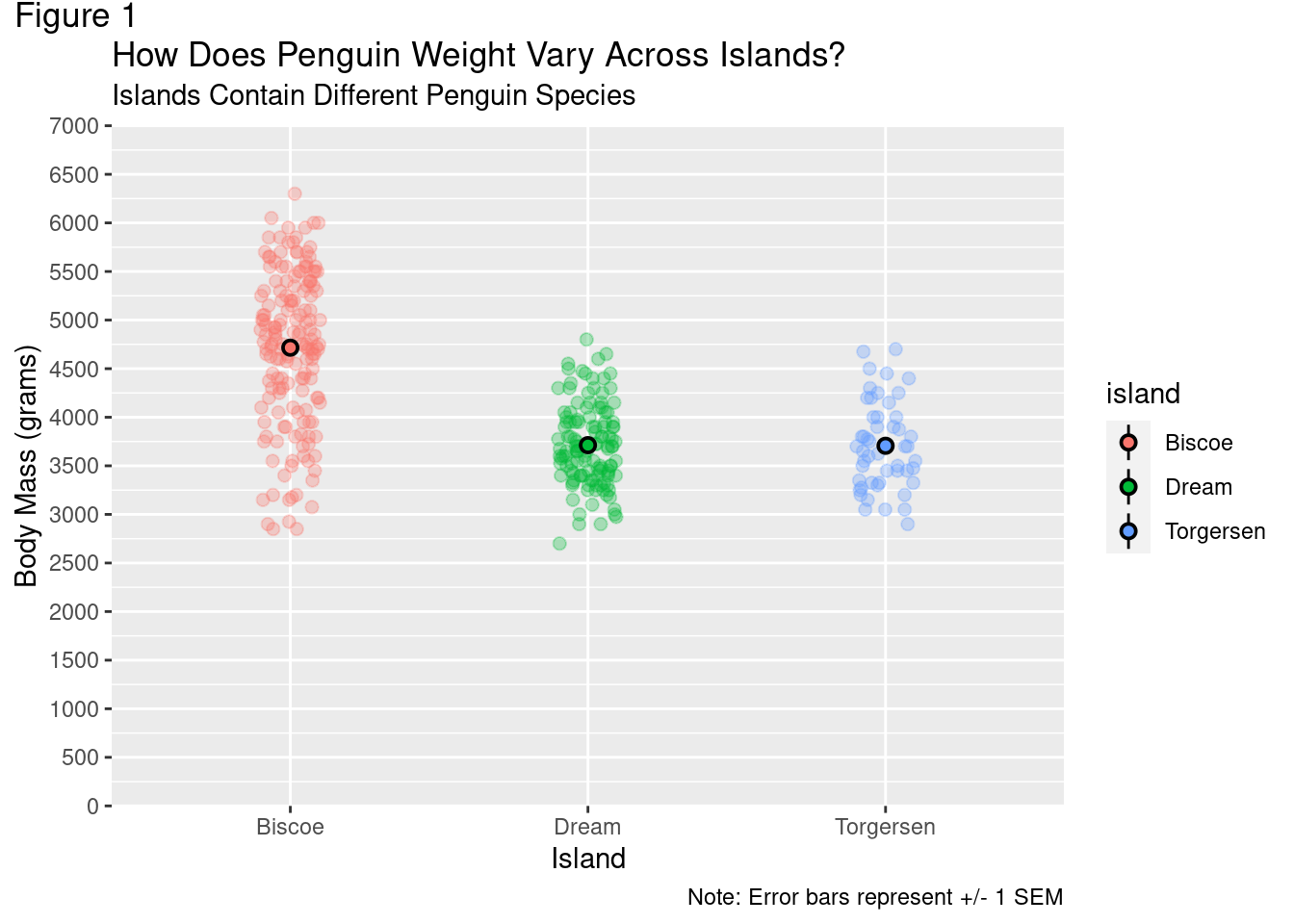
The specific arguments used are pretty self explanatory. While this added more information to the visualization, it does not particularly look great. The size of the title and subtitle are too close together, and both rather small. In fact, all the text is pretty small. The titles should be centered while the footnote should be left-aligned. Adding more information just created more that needs to be customized!
Note: Graphs here may look slightly different from those you generate with the same code. There is some hidden formatting in the back-end included to help the graphs render properly in the space constraint on this website.
9.3 Themes
The theme of a visualization is where most of the nuanced customization will take place.
First, all the tweaks made thus far will be saved, again to prevent the need from more copy/pasting:
Again, to prevent the need for more copy/pasting and long code strings, all subsequent changes will just be added and saved to one variable. The full code will be displayed at the end.
modified_plot = base_plot +
  coord_cartesian(ylim = c(0,7000)) +
  scale_y_continuous(breaks = seq(from = 0, to = 7000, by = 500),
                     labels = seq(from = 0, to = 7000, by = 500),
                     expand = c(0,0)) +
  labs(title = "How Does Penguin Weight Vary Across Islands?",
       subtitle = "Islands Contain Different Penguin Species",
       y = "Body Mass (grams)",
       x = "Island",
       tag = "Figure 1",
       caption = "Note: Error bars represent +/- 1 SEM")
ggplot comes with a number of built in themes that have preset settings. Among the most common are theme_minimal(), theme_bw(), and theme_classic().
modified_plot +
  theme_minimal()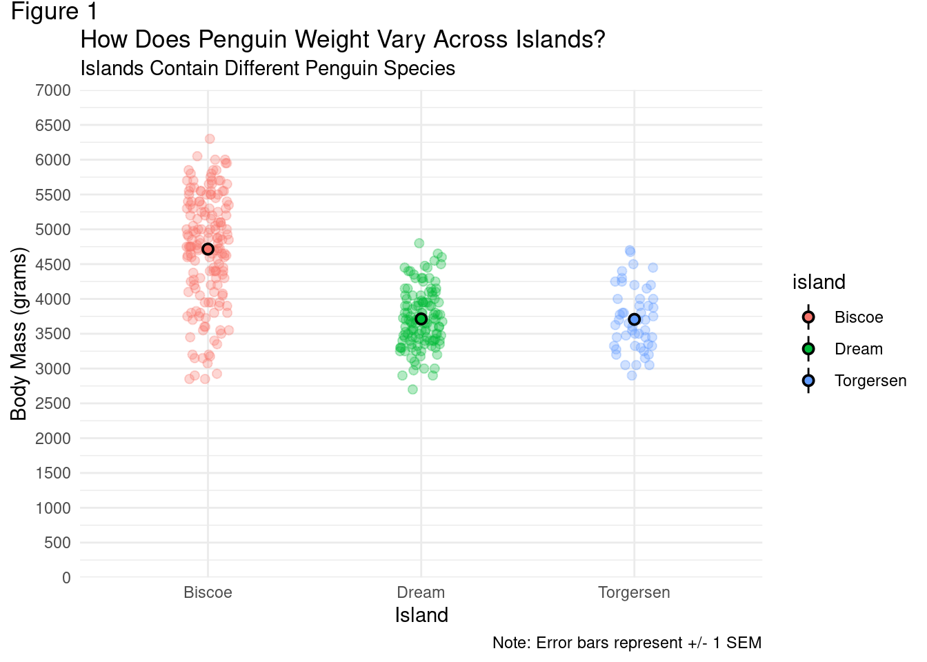
modified_plot +
  theme_bw()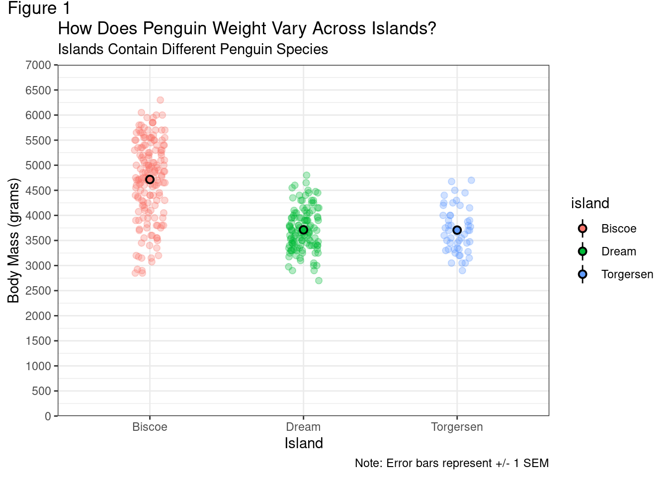
modified_plot +
  theme_classic()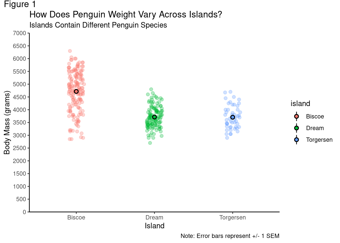
You should start to develop your own personal taste for which visualizations you find the most pleasing and informative. For the sake of illustration, subsequent figures will use theme_classic().
While using one of ggplot’s built in themes serves as a good starting point, to make manual changes to the theme’s settings, you use the theme() function. This function works as follows, generally speaking, you first specify the specific element of the visualization you want to modify, set that equal to what type of element it is with an element_*() call (e.g., text, line, blank, etc.), and then specify what part of that element you want to change and what value it should be equal to.
For example, if you wanted to change the title so the text had a size 18 font, you would add the following to your code:
theme(plot.title = element_text(size = 18))
You do not have to, and should not, commit to memory all the different visualization element names and arguments to modify! In fact, just check out this handy cheat sheet!
A few of the most common elements and ways in which you may want to modify them are highlighted below. These should be pretty intuitive, so there will not be a ton of explanation.
9.3.1 Titles
Changing some of the the size, font face (by making some bold), and color, of text in your visualization will help improve its overall legibility.
modified_plot = modified_plot +
  theme_classic() +
  theme(plot.title = element_text(size = 18),
        plot.subtitle = element_text(size = 10,
                                     color = "grey50",
                                     face = "bold"),
        plot.tag = element_text(face = "bold"))

modified_plot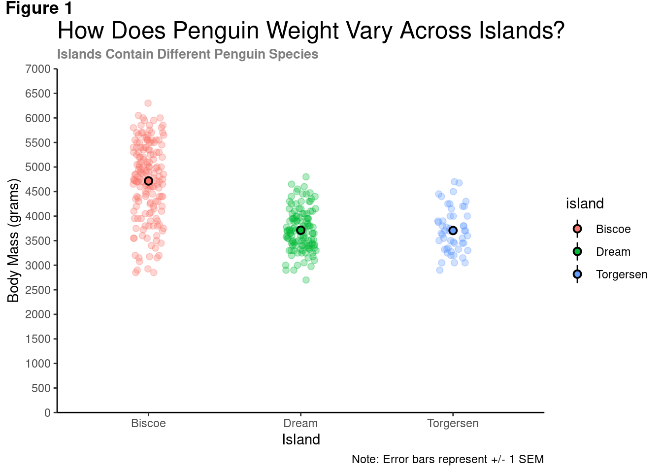
By default, most text in ggplot2 is left-aligned. To change the location of the text, you need to adjust its vertical or horizontal location in the coordinate system, using vjust or hjust, respectively. When adjusting:
- 0 == left-aligned
- 0.5 == centered
- 1 == right-aligned
modified_plot = modified_plot +
  theme(plot.title = element_text(size = 18,
                                  hjust = 0.5,
                                  face = "bold"),
        plot.subtitle = element_text(size = 10,
                                     color = "grey50",
                                     hjust = 0.5),
        plot.tag = element_text(face = "bold"))

modified_plot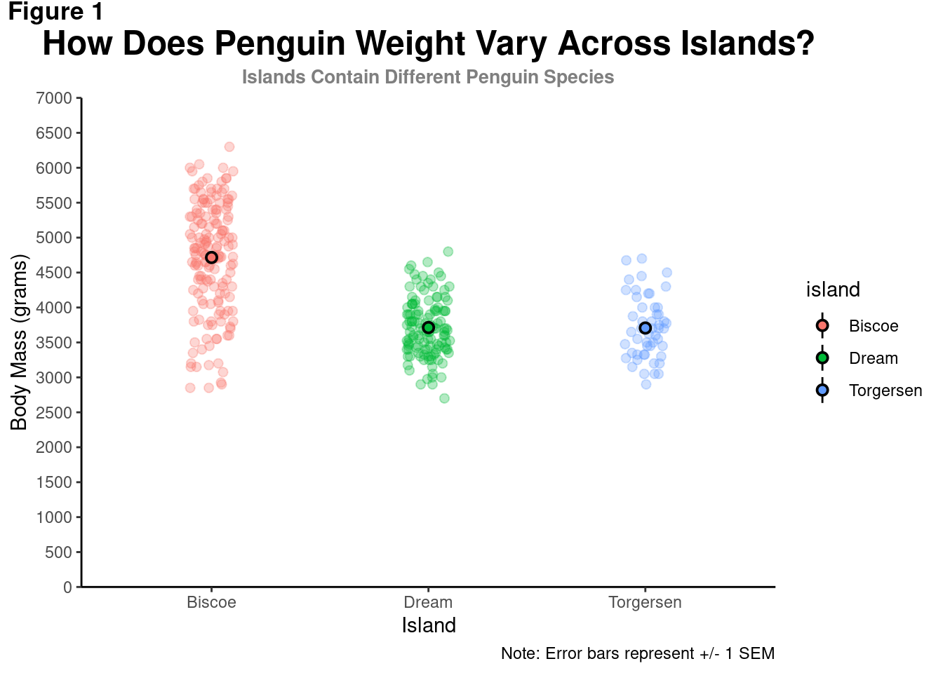
9.3.2 Captions
modified_plot = modified_plot +
  theme(plot.caption = element_text(hjust = 0,
                                    face = 'italic'))

modified_plot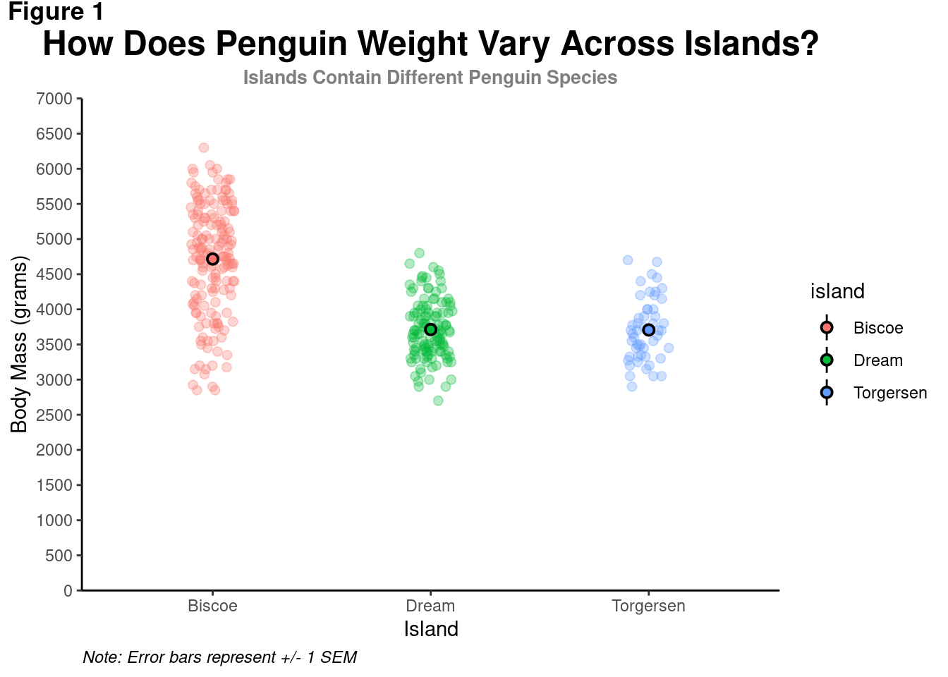
9.3.3 Axes Titles
When there are multiple elements in your visualization (e.g., multiple axis titles), you can either change both simultaneously (e.g., using axis.title) or specify each individually (e.g., using axis.title.x and axis.title.y).
modified_plot +
  theme(axis.title.x = element_text(size = 14,
                                    face = "bold"),
        axis.title.y = element_text(size = 14,
                                    face = "bold"))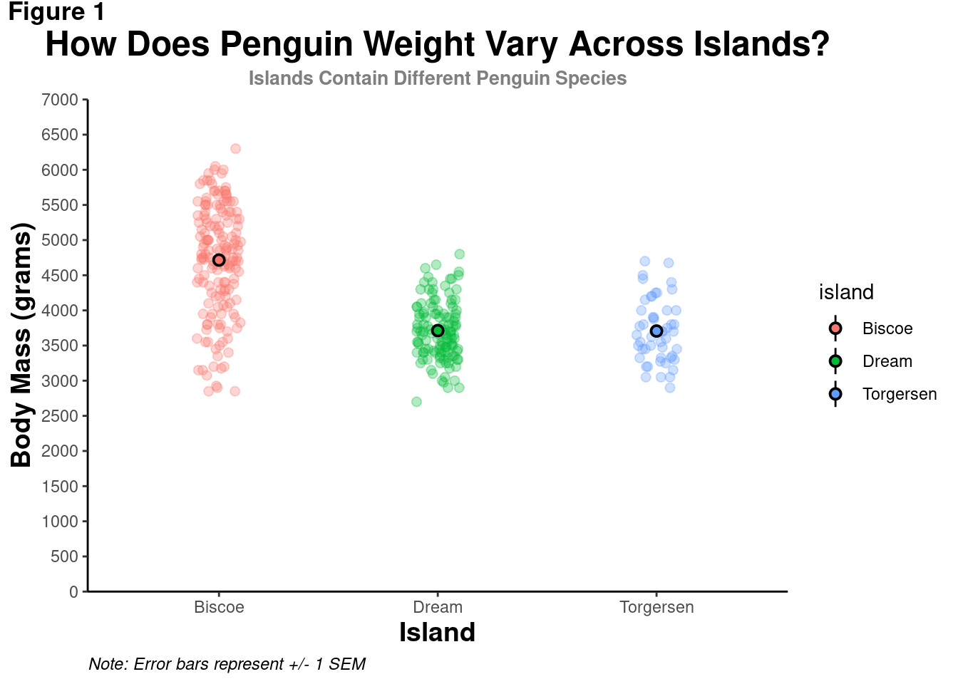
As the text gets bigger, the axes titles seem too close to the tick mark values. There needs to be some breathing room to keep the different elements visually distinct and easy to parse. Otherwise, your visualization will be in trouble This can be achieved by modifying the text’s margins – the area to the top, right, bottom, and left of it.
modified_plot = modified_plot +
  theme(plot.subtitle = element_text(size = 10,
                                     color = "grey50",
                                     hjust = 0.5,
                                     margin = margin(b = 0.2,
                                                     unit = "inch")),
        axis.title.x = element_text(size = 16,
                                    face = "bold",
                                    margin = margin(t = 0.2,
                                                    unit = "inch")),
        axis.title.y = element_text(size = 16,
                                    face = "bold",
                                    margin = margin(r = 0.2,
                                                    unit = "inch")))

modified_plot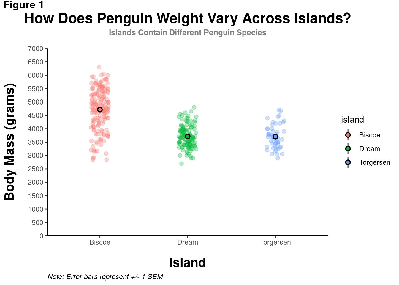
Notice that the margins are in reference to the overall orientation of the graph. To add space between the y-axis title and the values, even though it is the “bottom” of the element, it is to the right of the overall graph. Thus, some “r” space is added in margin().
9.3.4 Axes Values
You saw previously how the actual values on the axes could be modified with a scale_*_* function. The appearance of those values can also be customized. The values on the axis, as well as the tick marks and lines themselves!
modified_plot = modified_plot +
  theme(axis.line.x = element_line(color = "gray40", size = 0.5),
        axis.ticks = element_line(color = "gray40", size = 0.5),
        axis.text = element_text(face = "bold",
                                 color = "black",
                                 size = 12))

modified_plot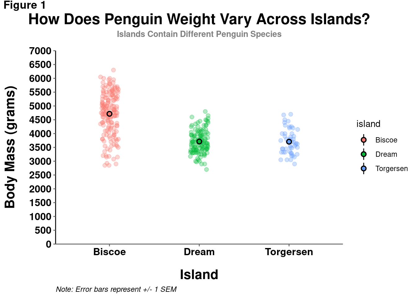
Note: It is generally not recommended to use different colors for your axis lines or tick marks, only using black to make them darker/more consistent and punchy. So, while you can technically set them to be any color, avoid using anything but black.
Now THAT is looking like a publication-worthy visualization!
9.3.5 Setting a Default
So you have gone through and learned all these ways to customize your visualizations. You may have started to develop a sense of what you think looks best generally – e.g., particular font sizes, spacing, etc. While individual visualizations will of course need some tweaks (like the correct titles), you may have some settings you think can serve as a good baseline.
Instead of having to include all the same theme() code for every single visualization you make:
theme(plot.title = element_text(size = 18,
                                face = "bold",
                                hjust = 0.5),
      plot.subtitle = element_text(size = 10,
                                   color = "grey50",
                                   face = "bold",
                                   hjust = 0.5,
                                   margin = margin(b = 0.2,
                                                   unit = "inch")),
      plot.tag = element_text(face = "bold"),
      plot.caption = element_text(hjust = 0,
                                  face = 'italic'),
      axis.title.x = element_text(size = 16,
                                  face = "bold",
                                  margin = margin(t = 0.2,
                                                  unit = "inch")),
      axis.title.y = element_text(size = 16,
                                  face = "bold",
                                  margin = margin(r = 0.2,
                                                  unit = "inch")),
      axis.line.x = element_line(color = "gray40", size = 0.5),
      axis.ticks = element_line(color = "gray40", size = 0.5),
      axis.text = element_text(face = "bold",
                               color = "black",
                               size = 12))
You can just set a default that will automatically be applied to all visualizations you make with ggplot until you restart your R session. You can do this with theme_set()
theme_set(theme_classic() +
            theme(plot.title = element_text(size = 18,
                                face = "bold",
                                hjust = 0.5),
      plot.subtitle = element_text(size = 10,
                                   color = "grey50",
                                   face = "bold",
                                   hjust = 0.5,
                                   margin = margin(b = 0.2,
                                                   unit = "inch")),
      plot.tag = element_text(face = "bold"),
      plot.caption = element_text(hjust = 0,
                                  face = 'italic'),
      axis.title.x = element_text(size = 16,
                                  face = "bold",
                                  margin = margin(t = 0.2,
                                                  unit = "inch")),
      axis.title.y = element_text(size = 16,
                                  face = "bold",
                                  margin = margin(r = 0.2,
                                                  unit = "inch")),
      axis.line.x = element_line(color = "gray40", size = 0.5),
      axis.ticks = element_line(color = "gray40", size = 0.5),
      axis.text = element_text(face = "bold",
                               color = "black",
                               size = 12)))
Now all new visualizations will automatically have these settings applied by default!
penguins %>%
  ggplot(aes(y = body_mass_g, x = island)) +
  geom_violin(aes(fill = island),
              alpha = 0.2) +
  geom_jitter(alpha = 0.4, width = 0.05) +
  stat_summary(fun.data = "mean_se",
               geom = "pointrange",
               aes(color = island),
               size = 0.5)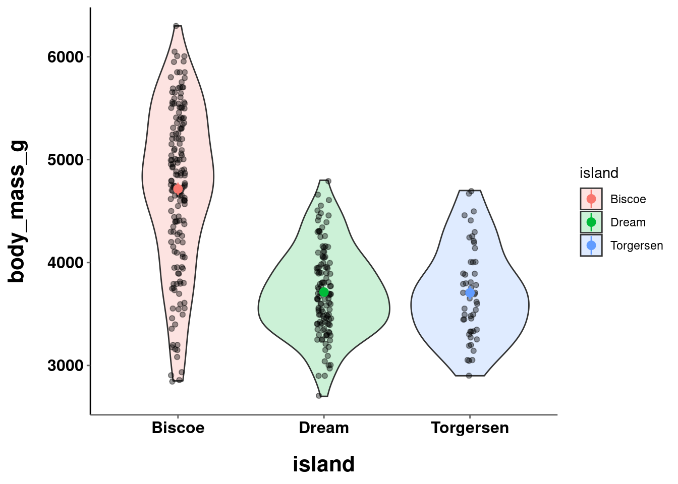
9.3.6 Legends
Modifying the visualization’s legend can be a bit tricky because there are a lot of changes you can make. One of the first options is to get rid of it altogether, since your graphs should not rely on a legend for comprehension:
modified_plot +
  theme(legend.position = "none")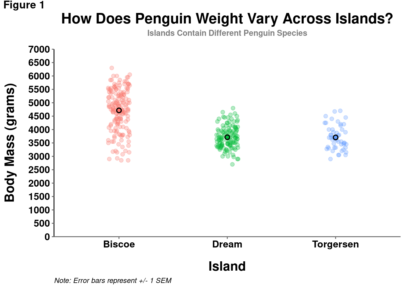
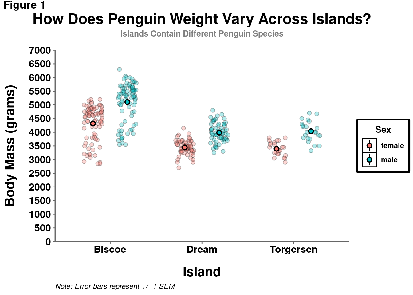
However, in certain cases, particularly if you are displaying information from another variable (e.g., indicating penguin sex by point shape), a legend is needed and customization may be useful.
penguins %>%
  drop_na() %>%
    ggplot(aes(y = body_mass_g, x = island)) +
    geom_point(size = 2, alpha = 0.3,
               shape = 21,
                aes(fill = sex),
                position = position_jitterdodge()) +
    stat_summary(fun.data = "mean_se",
                 geom = "pointrange",
                 color = "black",
                 aes(fill = sex),
                 shape = 21,
                 size = 0.5,
                 position = position_dodge(width = 0.75)) +
  coord_cartesian(ylim = c(0,7000)) +
  scale_y_continuous(breaks = seq(from = 0, to = 7000, by = 500),
                     labels = seq(from = 0, to = 7000, by = 500),
                     expand = c(0,0)) +
  labs(title = "How Does Penguin Weight Vary Across Islands?",
       subtitle = "Islands Contain Different Penguin Species",
       y = "Body Mass (grams)",
       x = "Island",
       tag = "Figure 1",
       caption = "Note: Error bars represent +/- 1 SEM",
        # New code starts here:
       fill = "Sex" # Change Legend label with the name of the mapped aesthetic.
       ) +
  theme(legend.box.background = element_rect(color = "black", # Add a defined box around legend
                                             size = 2),
        legend.title = element_text(face = "bold"), # Modify the title
        legend.text = element_text(face = "bold"), # Modify text
        legend.title.align = 0.5, # Change alignment of legend title. Think of this like an hjust.
        legend.key = element_rect(fill = "white", colour = "black") # Add defined boxes around legend key graphic
) 
9.4 Combining Graphs
With these newly acquired data visualization skills, you will likely be creating more than a single visualization at a time. To combine and arrange multiple graphs into a single figure, you can use the patchwork package!
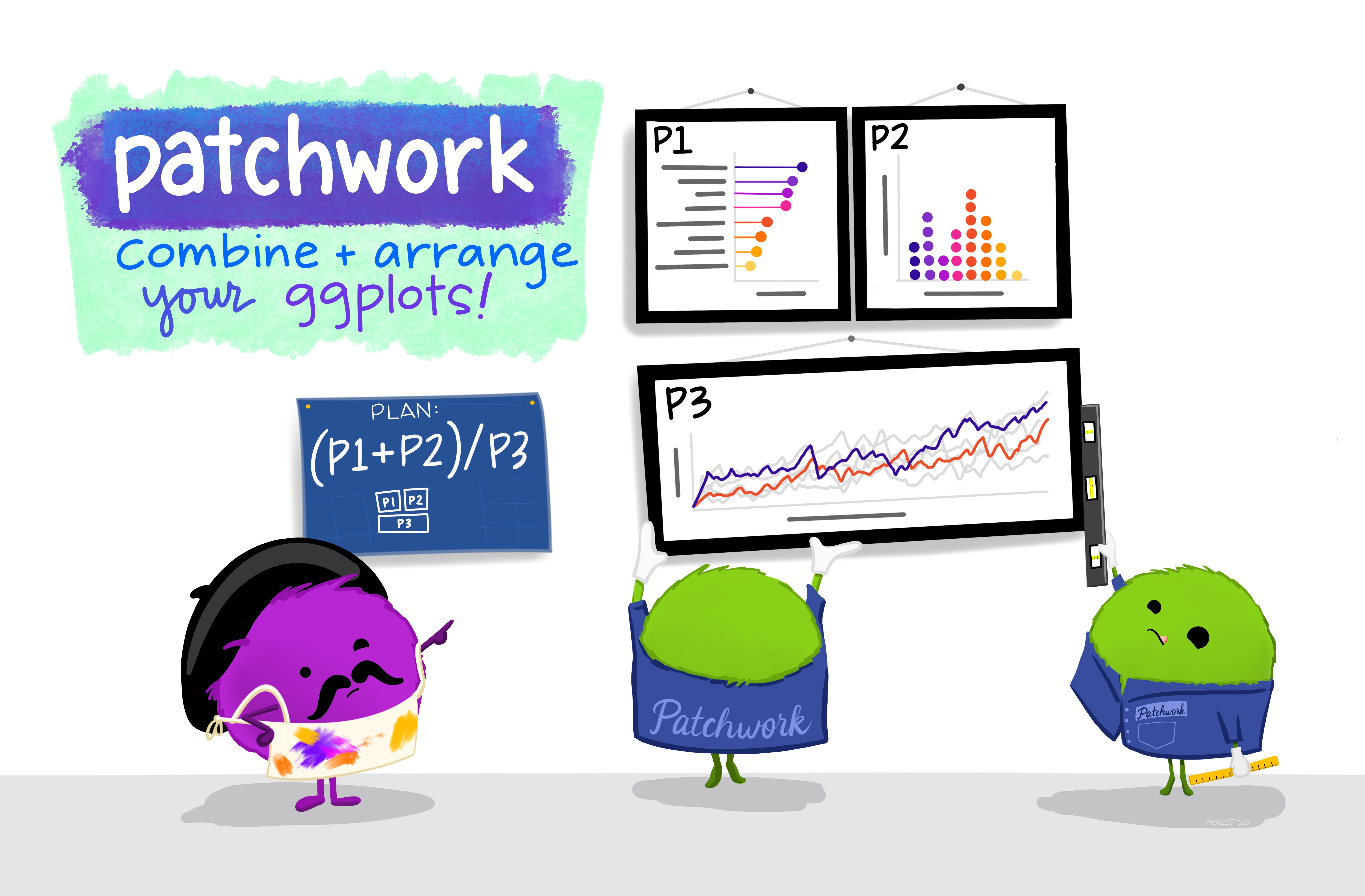
Artwork by Horst (2022)
Take the following 3 graphs for example:
a = penguins %>%
  ggplot(aes(y = body_mass_g, x = island)) +
  geom_jitter(height = 0, width = 0.1,
              size = 2, alpha = 0.3,
              aes(color=island)) +
    stat_summary(fun.data = "mean_se",
               geom = "pointrange",
               color = "black",
               aes(fill = island),
               shape = 21,
               size = 0.5)
a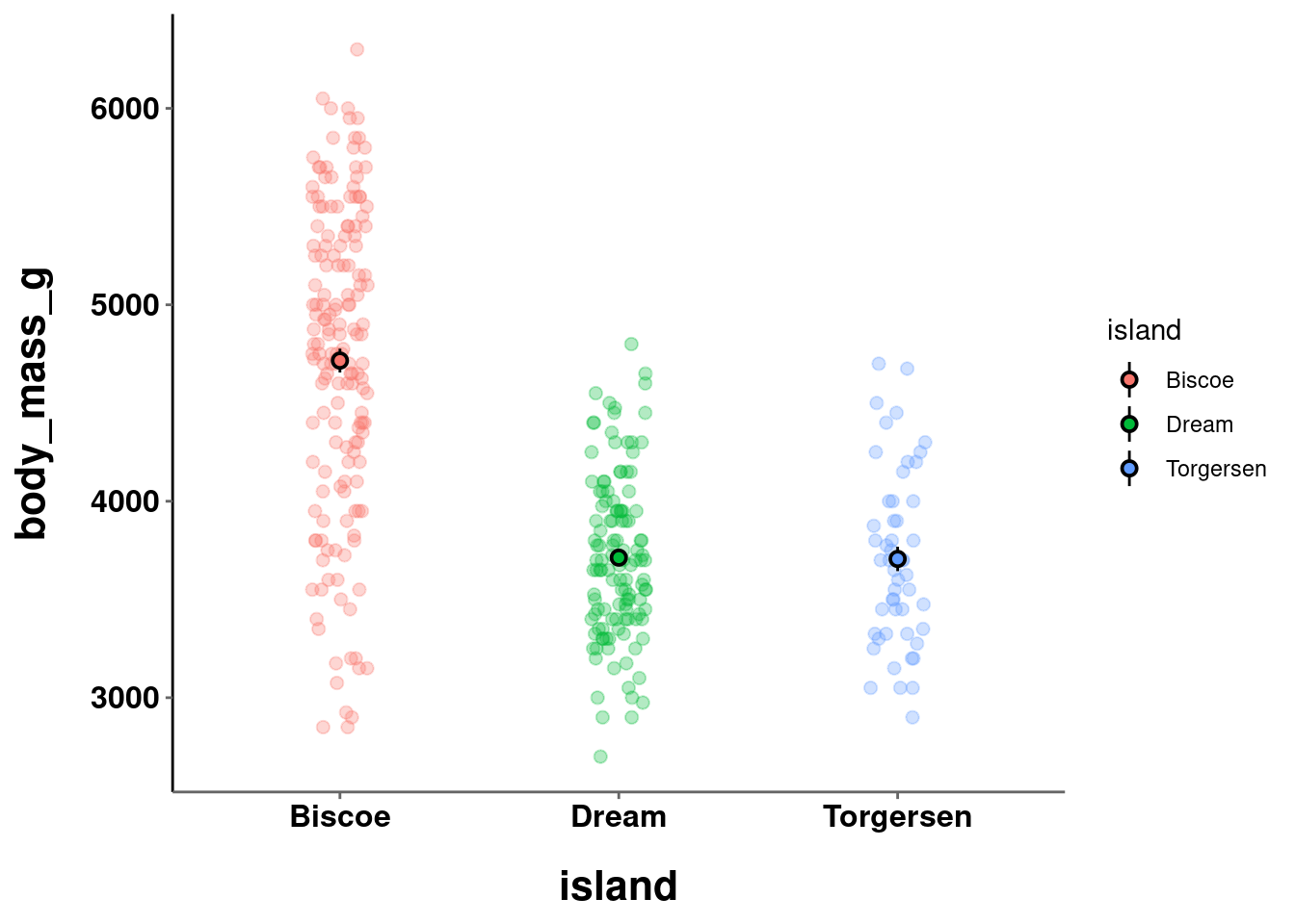
b = penguins %>%
  ggplot(aes(y = body_mass_g, x = species)) +
  geom_jitter(height = 0, width = 0.1,
              size = 2, alpha = 0.3,
              aes(color=species)) +
    stat_summary(fun.data = "mean_se",
               geom = "pointrange",
               color = "black",
               aes(fill = species),
               shape = 21,
               size = 0.5)
b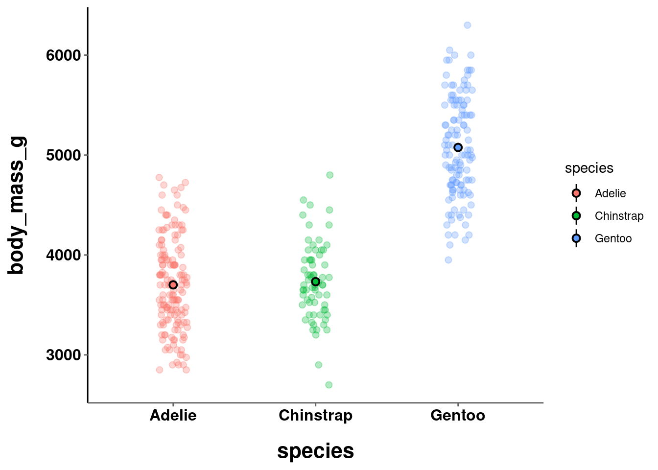
c = penguins %>%
  drop_na() %>%
    ggplot(aes(y = body_mass_g, x = sex)) +
    geom_point(size = 2, alpha = 0.3,
               shape = 21,
                aes(fill = sex),
                position = position_jitter(width = 0.1)) +
    stat_summary(fun.data = "mean_se",
                 geom = "pointrange",
                 color = "black",
                 aes(fill = sex),
                 shape = 21,
                 size = 0.5)
c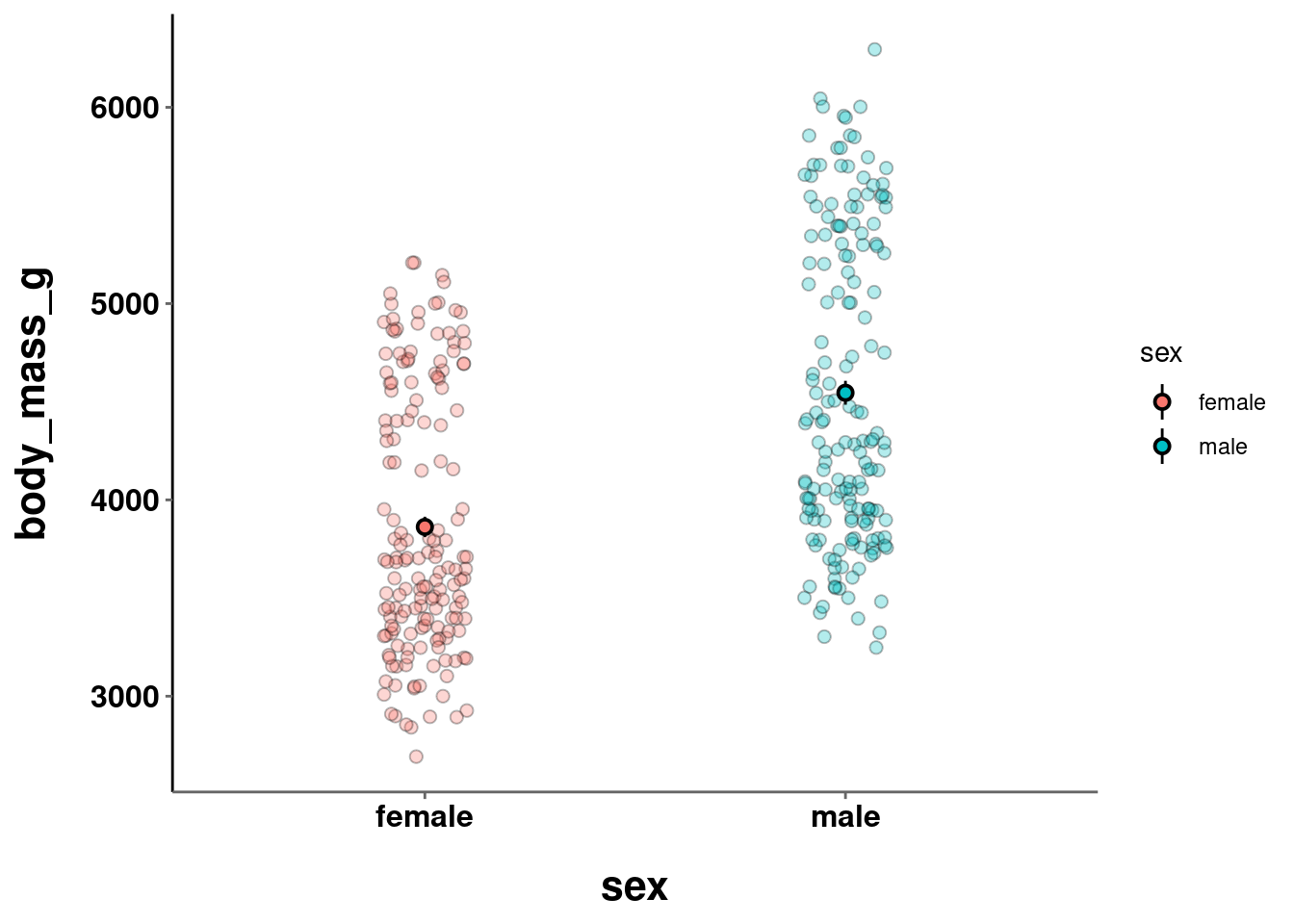
Patchwork uses a pretty intuitive system to create different layouts when combining graphs by using the +, /, and | operators.
+ combines graphs using the default layout (creating as square a grid as possible)
a + b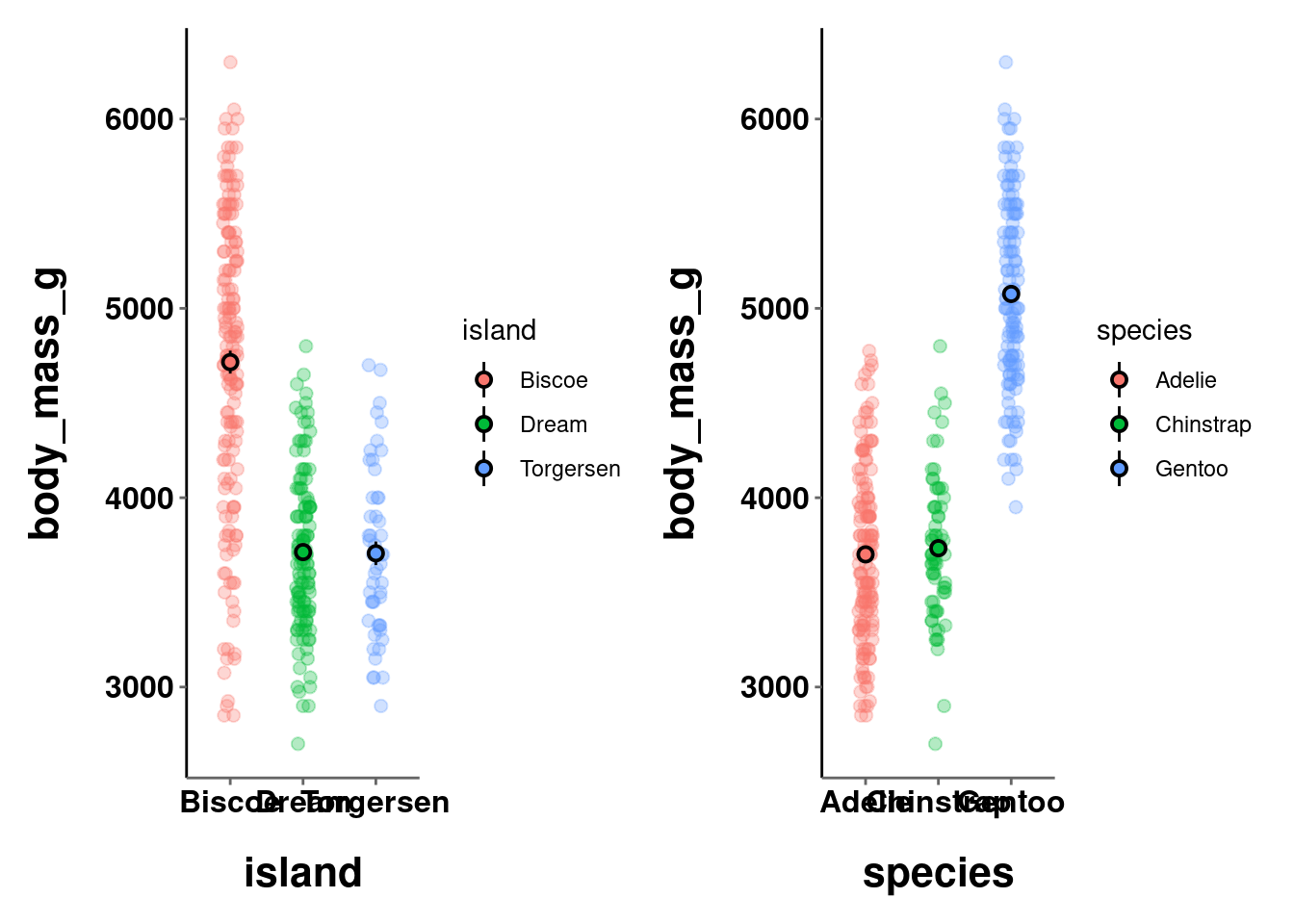
/ will stack graphs on top of each other
b / c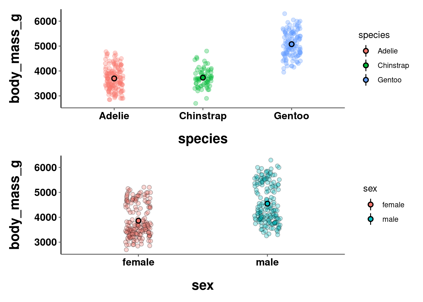
| places graphs next to each other and can nest arrangements created with the other operators. For up to 3 graphs the result from using | is identical to +. Using | best communicates the intended layout.
(c | (a / b))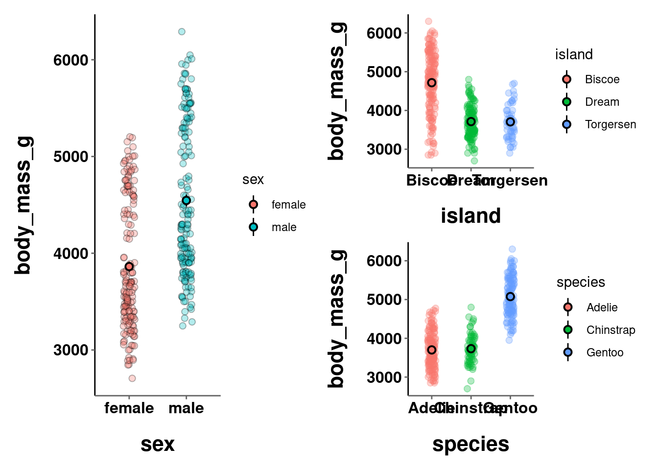
Note: The format settings defined for a single graph may not be best for an arrangement of multiple graphs combined into a single visualization. In the visualizations above, the axes titles and labels are a little too big, causing some of them to overlap and be unreadable.
9.5 Saving Graphs
Once you have created your masterpieces, you may want to export them so they can be added to manuscripts created outside of R, posters, or anything else. To save your ggplot graphs, you can use ggsave(). You have several file type options, but I would recommend pdf. It generally maintains a high resolution AND aspect ratio. In ggsave(), you must specify:
- the
filenameyou want your graph to be saved with (which can/should include a relative file path) - which
plotyou want to be saving - the
widthandheightof the file
ggsave(plot = a,
       filename = "visualizations/test_plot.pdf",
       width = 12,
       height = 8)